
If you manage a CMS, you’ve likely seen support messages like “I accidentally deleted my entire page” or “The formatting is broken and I don’t know how to fix it.” These “I broke my page” tickets often take up a big part of the support team’s time.
The issue isn’t the users. It’s the editor. When editors are confusing, hard to undo, or easy to break, mistakes happen.
The fix is simple: use an easy HTML editor with clear controls that stop errors before they start.
In this guide, we’ll explore how better editor UX directly reduces support work and how to make your CMS editor easier to use.
Key Takeaways
- Poor editor UX causes nearly half of CMS support tickets.
- Live preview shows changes instantly, so users don’t get confused.
- Undo and redo help users fix mistakes quickly.
- Tooltips and inline help make onboarding much easier.
- Simple editors work better than complex ones for most teams.
Now that we’ve seen the main ideas, let’s understand why editor UX has such a big impact on support teams.
Why Editor UX Matters for Support Teams
Content editors aren’t developers. They’re writers, marketers, or business owners who just want to publish content without breaking the site.
When an editor is confusing, users usually do one of three things:
- Submit support tickets (more work for your team)
- Make mistakes that need fixing later (even more work)
- Stop using features completely (your CMS loses value)
Nielsen Norman Group’s usability principles show that better interface design reduces confusion and saves users time. For a CMS, this simply means fewer mistakes and fewer support requests.
So how do you design an easy HTML editor that avoids these problems? It comes down to a few simple principles.
See also: How Liveness Detection Technology Is Combating Deepfake Threats
The Four Pillars of Support-Reducing Editor Design
These four basics help content editors work confidently without breaking pages. When editors are simple, visual, and forgiving, support tickets drop naturally.
Let’s start with the most important one: helping users see what they’re doing in real time.
1. Visual Formatting Previews
The Problem: Users write content, but can’t see how it will look on the site. After publishing, they notice mistakes, panic, and raise a support ticket.
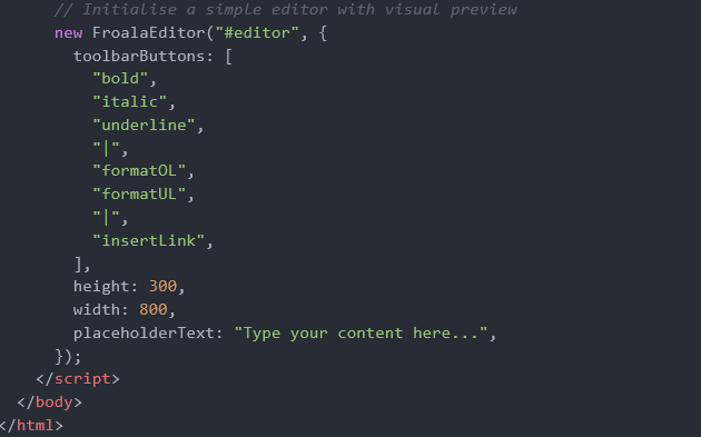
The Solution: Use a real-time WYSIWYG editor like Froala so users see exactly what they’re creating as they type.
Simple Implementation Example:
Why this helps: This basic setup gives users immediate visual feedback. When they click “bold,” they
instantly see bold text, so no guessing is required.
Even with live previews, mistakes still happen. That’s where the next pillar becomes important.
2. Forgiving Undo/Redo Functionality
The Problem: A single accidental keystroke deletes hours of work. Users panic and send “I lost everything” tickets.
Why this helps: Users can experiment fearlessly, knowing they can always revert changes. This reduces both mistakes and anxiety-driven support requests.
Once users feel safe undoing mistakes, the next challenge is understanding what each action actually does.
3. Inline Help and Smart Tooltips
The Problem: Users hover over icons, wondering “What does this button do?” They either click randomly (creating a mess) or submit tickets requesting explanations.
The Solution: Show short tips and tooltips exactly where users need them.
Baymard Institute explains that inline help and real-time validation reduce user errors and ease error recovery.
Implementation with Clear Tooltips:
Why this helps: Clear hints reduce confusion and stop unnecessary “How does this work?” tickets.
But help alone isn’t enough if the editor feels overwhelmed. This leads to the final pillar.
4. Simplified, Focused Toolbars
The Problem: Overwhelming toolbars with 50+ buttons confuse users. They can’t find basic functions and end up accidentally clicking advanced features they don’t understand.
The Solution: Start with essential tools only. Add advanced options in a secondary menu for power users.
Smashing Magazine’s comprehensive guide to user experience design recommends minimising visible options and reducing interface complexity, because too many choices can overwhelm users and increase cognitive load.
Toolbar Example:
Why this helps: A clean toolbar keeps users focused and reduces accidental mistakes.
When these four pillars work together, small design details make an even bigger difference.
Best Practices for Support-Reducing Editors
Here are some simple tips to make editors easier to use and help prevent mistakes before users ask for help.
- Provide instant visual feedback for every action so users always see what they’re doing.
- Use clear button names and tooltips to explain actions.
- Display save and draft status clearly so users know their work is safe.
- Enable auto-save to avoid losing content.
- Test with real content editors, not just developers.
Just as important as what to build is knowing what to avoid.
Common Pitfalls to Avoid
These are simple mistakes that make editors hard to use and increase support tickets. Avoiding them can save a lot of time for both users and support teams.
- Don’t hide undo and redo buttons: Users should always see how to undo mistakes quickly.
- Avoid technical words in error messages: Say “Image is too large” instead of technical errors that users won’t understand.
- Don’t expect users to know HTML: Basic formatting should work with buttons, not code.
- Never delete content without warning: Always ask before removing or replacing text.
- Don’t overload the toolbar: Show only important tools first. Rare features can stay hidden.
After improving your editor, the next step is to make sure those changes are actually working.
Measuring the Impact
These metrics help you see whether your editor changes are actually working:
- Support ticket volume: Look for fewer tickets about formatting, lost content, or basic “how do I…” questions.
- Time to first publish: Check how long new users take to publish their first page.
- Feature usage: See which editor features people really use and which they ignore.
- User feedback: Use simple in-app prompts to track satisfaction and frustration.
Research from Screendesk shows that UX improvements can reduce error-related support tickets by 25-40%.
The results all point to one clear idea: better editor UX means fewer problems for everyone.
Conclusion
The best support ticket is the one that’s never submitted. By choosing an easy HTML editor like Froala with intuitive UX, you’re not just improving the content creation experience; you’re directly reducing the burden on your support team.
Focus on four basics: visual previews, forgiving undo systems, inline help, and simplified interfaces. When users feel safe editing, they make fewer mistakes and ask for less help.
Spending time on a better editor design pays off. Your content team works faster, your support team feels less pressure, and your CMS becomes easier to use.
Start by implementing the basic examples in this guide, measure your results, and improve based on real user feedback. Your support ticket queue will thank you.